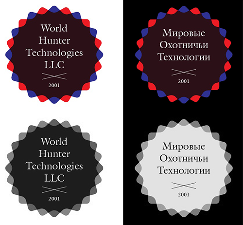
A logo concept developed as part of a freelance collaboration that did not move forward. The project did not progress beyond the exploratory stage and was never implemented.
Challenge
The task lacked clear direction and strategic grounding, making it difficult to move from visual experimentation to a coherent brand solution.
Solution
Several badge- and seal-inspired logo variations were created to explore composition, color contrast, and typographic hierarchy across different language versions. The badge form was intentionally chosen to suggest exclusivity, premium quality, and professionalism, functioning as a symbolic mark of trust and quality.
Result
The project was discontinued, but it remains a small exploratory exercise in visual form, symbolism, and presentation rather than a finalized branding outcome.